Welcome to Ask Dr Dulux. In this series, we answer your burning decorating questions and give you all the practical advice you need to take on your next painting project, big or small. Got a question you’d like to ask? Share it over on social using #AskDrDulux and we could be answering your question next in the series.
This week, Jo Wilson from Brighton asked: “Dark paint colours are a big trend right now. How should I use them in my home?”
We’re so pleased you asked this question, Jo. Many of us assume that painting our homes in darker colours will make our space look gloomy, small and claustrophobic, but that’s not the case. When executed properly, dark colour palettes can be cosy, dramatic and energising.
Everything from room size to lighting can affect how you choose a colour scheme for your space, so to help you make confident colour decisions, we’ve pulled this video together for you, along with some top tips below. For more advice, check out our guide to choosing your perfect paint palette. We look forward to seeing what you do with your space!
Ease in with a feature wall
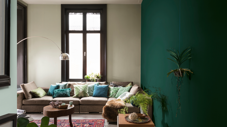
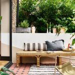
If you’re nervous about venturing away from a neutral colour palette, build up your colour confidence by painting a feature wall in a darker shade and see how it feels. Pick a wall that can be used to highlight an interesting focal point in the room – in a living room, this might be the wall where the fireplace sits or behind a cosy corner sofa. The pale walls – painted in 30BB 62/044 – in this botanical-inspired lounge look great teamed with a feature wall in 70GG 13/323.
As a good rule of thumb, you want to follow where your eye is naturally drawn to in the space, so let the room’s architecture and key furnishings be your guide. Beyond feature walls, you can also ease into a darker colour palette by painting the woodwork around your windows in a dark shade such as 30BB 05/022 to add definition.
Small space, big impact
It might seem counter-intuitive, but rooms that are already dark and small – think a downstairs loo or utility space – are ideal for playing around with dark colours. Small spaces with little or no light are actually given a bigger presence when painted with dark shades.
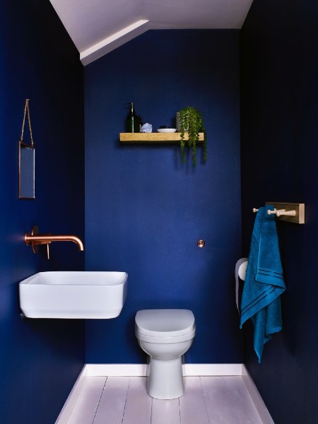
For example, we love this downstairs loo painted in 50BB 11/321; an energising, deep blue. The woodwork painted in a light shade like 00NN 83/000 together with the copper accessories helps to offset and balance out the darker walls.
Bring a cosy feel to a larger space
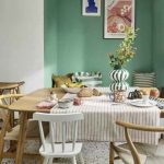
Darker colour palettes, when used on the walls of a larger space, can bring a sense of intimacy and homeliness to the room by closing it in. That’s because a lot of richly-pigmented tones have a sophisticated and luxurious feel to them, so they’re a great choice for rooms where you want to create a welcoming and intimate atmosphere – think living rooms, dining rooms and bedrooms.
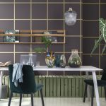
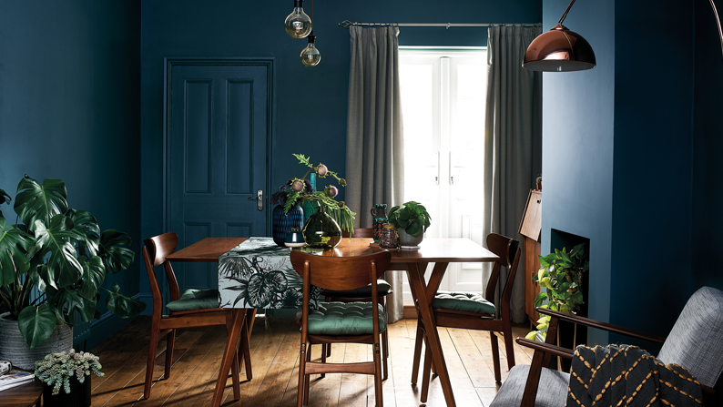
If you want to make a real statement, you can even think outside the walls. Painting woodwork and moulding in the same shade – this dining room uses 27BB 10/138 everywhere – not only amplifies the boldness and creates a unified look but can also make the room look as if it’s naturally lit with sunlight.
Create contrast & balance
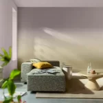
Your choice of furniture and accessories are key to making sure you don’t weigh down a darker room. Instead, you want to create contrast with furnishings in a mix of materials and textures that pop against your dark walls.
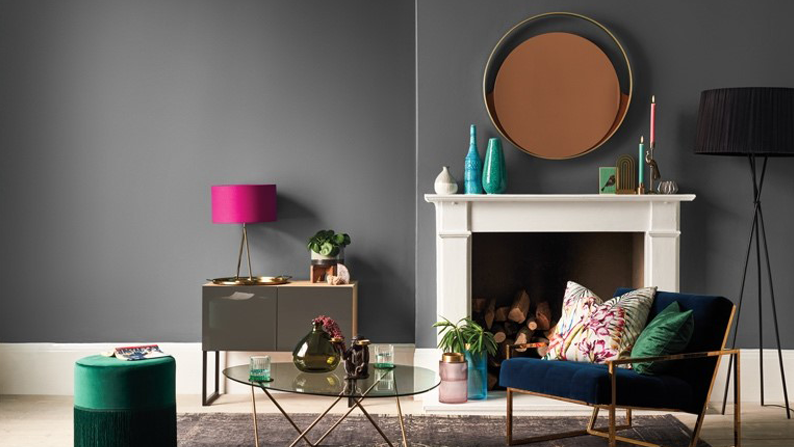
This lounge, painted in 30BB 31/022, looks great offset with light wooden floors, a mirror, a velvet blue sofa and copper accents on the accessories. Painting your woodwork in a paler shade – try 00NN 83/000 – can also help to frame dark walls and tone them down.
Don’t forget about the ceiling
A dark paint colour can turn the fifth wall – that’s your ceiling – into a focal point. Not sure what colour to go for? Look around your room for inspiration. Picking a colour that’s subtly represented in the room, such as in on a throw or rug, can bring a nice sense of synergy.
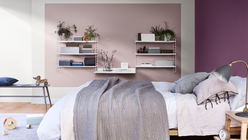
The ceiling in this bedroom – painted in 90BB 21/220 – takes inspiration from the purple tones of the bed throw. The deep purple ceiling looks great teamed with walls painted in contrasting shades of 10YR 28/072 and 53YY 77/064. Explore other ways to use colour on your ceiling in our article on how to transform your dining space.