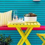
You can embrace style in high traffic spaces. And here’s how.
Whether you’re looking to bring a sense of calm to a busy living room, or give a little oomph to a high traffic hallway, having hard-working paint will keep your room looking fresh. That’s where Easycare comes in.
It’s our new range of tough and washable paint that’s 20 times tougher than normal Dulux matt emulsion. Thanks to its smart stain repelling technology, it removes everything from stubborn marks, fingerprints and all the wear and tear of daily family life with a wipe. Think of it as your wall’s ultimate coat of armour.
Featuring an array of beautiful shades; from soothing blues to warm blush tones, there’s something to make every home look its best.
Here are seven of our favourite Easycare colour scheme ideas and how you can use them in your home.
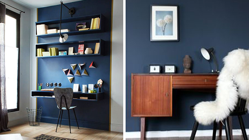
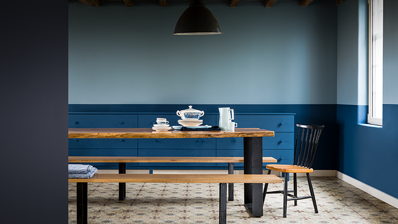
1. 50BB 11/321
Welcome to the dark side. Yep, the ‘Dark & Light’ trend is still going strong, and a deep navy shade like 50BB 11/321 is a great alternative to grey if you want impact without forsaking colour. Add a lick of the rich blue shade to a feature wall or a ‘zone’ to create an on-trend multitasking room.
Expert tip
When using a dark palette, a combination of surfaces and textures will bring depth to your space as well. Pile on the sheepskin.
2. 87BG 27/077
The two-tone effect is an easy-peasy way to bring depth and interest to a busy open-plan room. This calming living space features 87BG 27/077 with 27BB 10/138. Keep the lighter shade on the top half to heighten the look of your ceiling. Take it one step further and use the same dark blue on the furniture too. It’ll avoiding any visual disruptions to the effect, making spaces appear roomier.
Expert tip
Looking for a different combination? One reliable strategy is to pick two shades from the same colour family, or from the same paint swatch card.
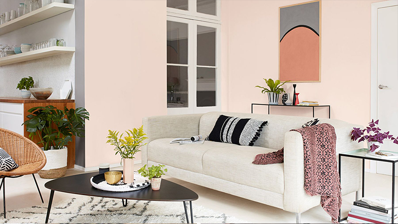
3. 30RB 68/084
Cosy up an open plan space with a hint of 30RB 68/084. This delicate shade of pink will lend multifunctional spaces warmth and cosiness, creating a relaxed, laid-back mood. Pick out architectural details using grey tones such as 50YR 53/011 and keep trims and doors a crisp Absolute White.
Expert tip
To layer up your rose tinted space add soft textures and pops of dusky pinks. And finally, to create contrast and a contemporary twist to your colour scheme add crisp black furniture and accessories. Peachy!
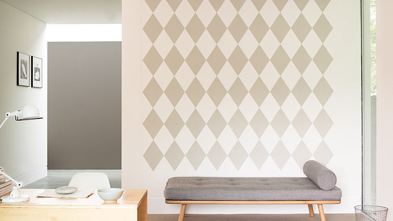
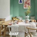
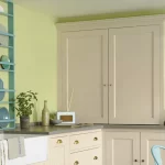
4. 90YR 73/029
Give your neutral colour scheme an element of interest with a playful feature wall (a bold pattern can hide a multitude of sins after all). If your home office is less of a room and more of a ‘space’, this patterned effect works wonders to ‘zone’ a dedicated space visually to your work space. Keep things grown up by using a scheme made up of neutrals such as 90YR 73/029.
Expert tip
Watch the step-by-step video to see How to Achieve a Diamond Paint Effect for yourself.
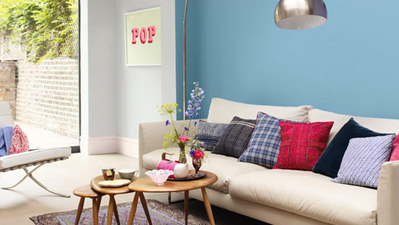
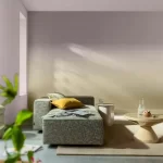
5. 56BB 45/240
The colour of the sea and sky (on a good day), we’re hardwired to find blues calming and serene. 56BB 45/240 will transport you back to mother nature and give a carefree feeling to your space, no matter how much foot traffic is coming and going through the room.
Expert tip
Contrast pops of colour against this sky blue backdrop for a dynamic and eclectic look – it’ll only take a few small accents to give Nordic Sky a whole new outlook. Bright cushions, flowers and artwork can be changed whenever the mood takes you so dive in.
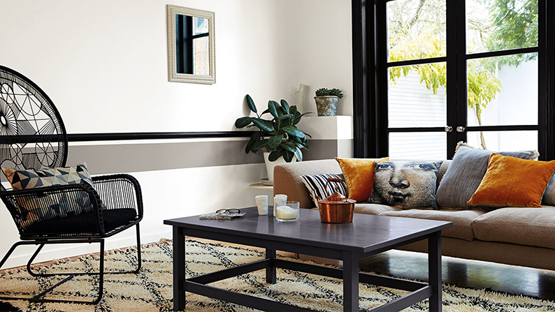
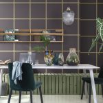
6. 12BB 82/058
A contemporary update on a timeless monochrome colour scheme can be easily achieved by painting walls in a hard-working Easycare white such as 12BB 82/058 and introducing Black along woodwork with a lick of Quick Dry Satinwood. Try black around window frames, on picture or dado rails or on skirting boards to draw your eye around the space – you’d be surprised at how a few little updates will give your home a completely different feel.
Expert tip
Team your striking dark accents with calm off-white shades such as 70BB 73/055 and 74BB 58/090. Then turn the impact up a notch by bringing in dark furniture and accessories for added graphic appeal. Looking sharp!
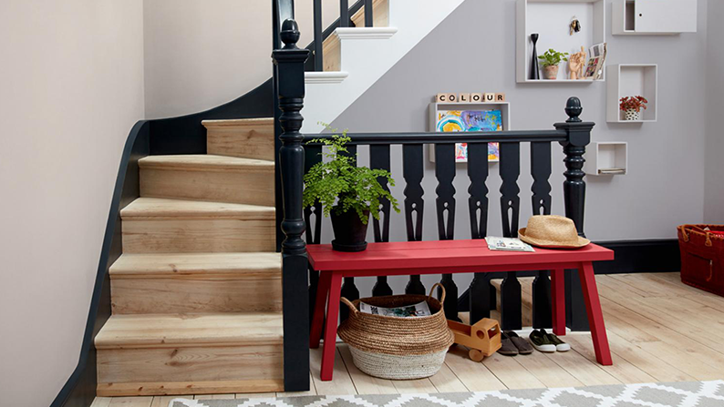
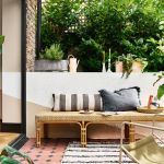
7. 70BB 35/108
The go–to shade for stylish spaces, grey has become a colour with cult status, and this trendy shade is not going anywhere. The best thing about grey is that it’s so versatile and works as a great backdrop to introduce other hues like the bold 05 YR 13/387 bench. Try using two calm co-ordinating greys such as 70BB 35/108 and Natural Taupe and keep things contemporary and sharp with rails and trims in Black.
Find out more about our Easycare range and see all available colours on the Easycare product page.