It’s easy to feel lost in a large open-plan space, especially if it’s performing multiple roles. If you’re looking for a simple but effective solution, Dr Dulux recommends giving zoning a go.
Using different colours of paint, you can bring focus to separate areas of your room. Better yet, our Colour of the Year 2022, Bright Skies, and its ready-made complementary colour palettes provide you with the perfect colour combinations to make zoning easy.
How you use these shades depends on the function of each area. Not sure where to start? Here are four ways to zone using our Colour of the Year 2022, Bright Skies.
Paint a dedicated home office

If you’re working from home and don’t have the luxury of a study or home office, you can still create a dedicated workspace in your bedroom or living room. You just need the right colours of paint. The Workshop palette is perfect for zoning a multi-functional space, thanks to its unique selection of vibrant and adaptable hues.
Here we used warm tones to separate the desk area from the rest of the bedroom. We then painted the ceiling with Bright Skies to make the room feel fresh, airy and in touch with nature.
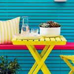
Divide a space for homework and play

When your child’s bedroom is doubling up as a playroom and study area, a clever solution is to split the room in two using different colours.
Light Blue is the best colour for inspiring focus and concentration, while a coordinating tone of muted mustard is perfect for play time. To distinguish the areas even further, try painting a dividing line in a vibrant colour of yellow, like we have here.
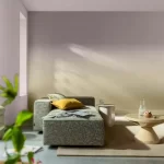
Highlight a standout feature

One way to break up a large open-plan living room is to single out a particular section with colour. Take a look at this mezzanine-level office, for example. We used our Colour of the Year 2022, Bright Skies to define the space and separate work from relaxation. This light, airy and optimistic shade is also great for boosting concentration.
For the rest of the room, we integrated soft shades of pale pink and muted mustard. It’s the perfect space for unwinding at the end of a busy day.
Link rooms with colours of paint

If you have a partial division between connecting rooms, painting walls with complementary colours of paint can create a seamless flow from one room to the other.
Here, a circle of light blue echoes the colour of the walls beyond and draws the airy feeling of the sky from the home office into the hallway. You can continue this sense of unity by styling each space with natural materials and warm tones.
Watch our video on ‘How to zone an open plan space’ for more wall painting tips and ideas.