Like fashion and food, interiors experience trends as our world turns and our tastes evolve, while colours are often informed by the mood of the nation.
Marianne Shillingford, Dulux Creative Director, says: “This year, we’re thinking pink – although the most beautiful iterations are far from Barbie-esque – while green is gathering momentum as we continue to embrace nature indoors. Elsewhere, neutrals are big news – although the best are anything but boring – as are blues of all different shades. The wild-card? Yellow, after falling out of favour for a while, is back! I can’t wait to try our spin on the sunny hue in my own home. Think bright and breezy hallways, kitchens and bedrooms that lift the spirits and raise a smile.”
Harnessing the same process and expertise used to devise Dulux Colour of the Year for the past 20 years – where our esteemed panel of professionals translates global design trends into a single trending shade that captures the mood of the moment – we round-up the colours that will define how you decorate in 2024.
Be the first in-the-know – and the first to try them
Think pink
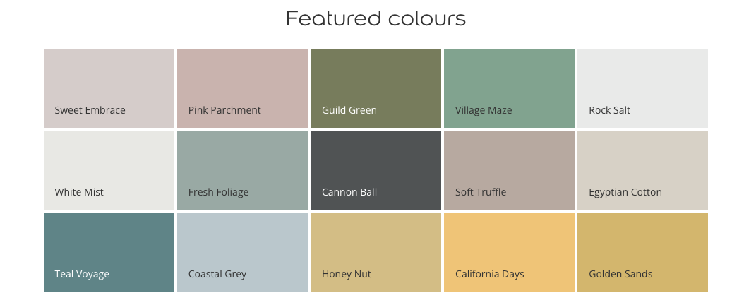
Soft and calming, pink is taking our Pinterest boards by storm, although it’s out with hot pink and in with pale versions for 2024. The muted tones that are making waves are best epitomised by Sweet Embrace, Dulux Colour of the Year 2024, a delicate colour that brings a feeling of positivity to our lives. Soothing and subtle, it’s spectacular as the star of the show, or better still with another shade. Indeed, it complements so many other colours – whether earth tones, blues and greens, or yellows and lilacs – and creates a warm backdrop on which to build a scheme. As seen in this kitchen, Pink Parchment offers similar qualities, albeit with an earthier pigment. Toastier than whites and subtler than reds, pink is the versatile shade we’ve all been looking for.
Green scene
Biophilia is still a big story in 2024, as we continue to bring the outdoors in. From forests to lakes and fields, greens inspired by the colours of nature provide comfort, while being both relaxing and invigorating. Take a leaf out of our book and add a lick of cocooning Guild Green, our twist on olive, to your bathroom; or uplifting Village Maze to your kitchen. Both work equally well with cooling neutrals like Rock Salt or White Mist. For something paler, Fresh Foliage is a watery hue with a vintage air that creates tranquil spaces for living rooms or bedrooms. As one of the most flexible colours in the spectrum, you can pair green with a plethora of shades, from other greens and pink to black and blue.
Remain neutral
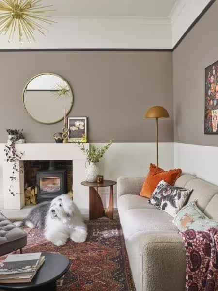
We’re nailing neutrals right now. But these new-wave neutrals are about as far from bland as you can get. In fact, they can be largely credited with the ‘quiet luxury’ trend – an aesthetic that whispers rather than shouts – where less really is more. Luckily, we’ve translated the trope into timeless shades that are easy to live with, from Cannon Ball to Soft Truffle and Egyptian Cotton. Like the base of a brilliant outfit, these are hues to go with anything, for any occasion, so use them as a canvas for your creativity in whatever room you choose. Here, we’ve added pops of brighter colour, such as burnt orange, to dial up the cosy.
True blue
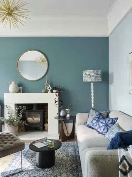
Whether inspired by the deepest ocean or the dreamiest sky, blues are big for 2024 and beyond, evoking a sense of calm and positivity. Experiment with different shades to discover their delights when it comes to your décor: light, bright blues can open up spaces and make them feel bigger than they are; while dark, moody blues can cosy things up and add a touch of luxury. In this living room, we’ve celebrated the calming nature of blue by using different shades of the same colour, from tranquil Teal Voyage on the feature wall to soft Coastal Grey on the other. Complemented by accessories in blue elsewhere, the effect is a timeless space that’s conducive to rest and relaxation.
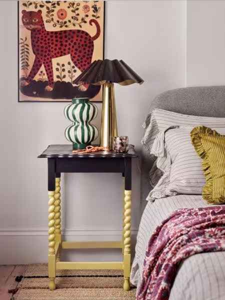
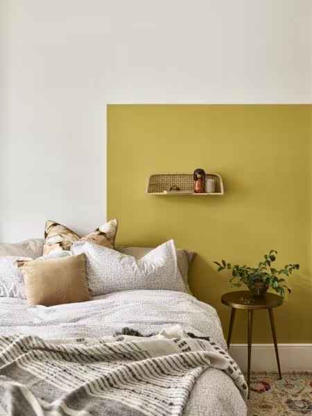
Pot of gold
Once the colour of choice for bathrooms, nurseries and bedrooms, yellow is winding its way back into fashion, albeit a bit more grown-up than past iterations. Take Honey Nut, for example, which has just a hint of black for a mustardy tone; the sunny disposition of California Days; and Golden Sands, which beckons you to the beach to unearth buried treasure. These are yellows that are anything but mellow and have a little more going on than their predecessors. Why the revival? We’re seeking joyful spaces that put a smile on our faces and we want to feel uplifted the moment we step through the front door.
Browse our collection of ready-mixed colours for the most popular shades, or take a sample in-store to have it matched then mixed, just for you.
See how shortlisted hues will look in your home with our free Visualizer app.